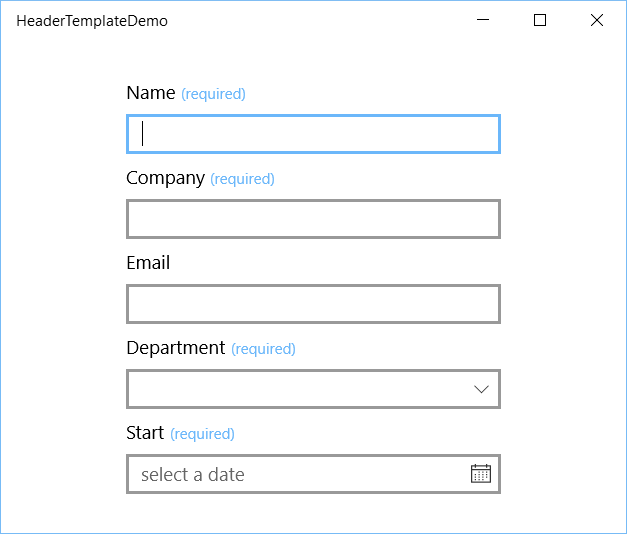
In a LOB application it is very common to have headers above an input controls (TextBox, ComboBox, Pickers, etc.) which also indicates that the data is required. This can easily be implemented in a XAML/UWP application using the HeaderTemplate property of the input controls.
Demo
In the following Page I have created a DataTemplate with the key RequiredHeaderTemplate. It contains StackPanel with 2 TextBlocks. The first is used to show the Header value. It is data bound to the Text of the TextBlock. The second is showing the '(required)' text in the accent color and a small font. The input controls in the page all have a header. The required ones also have the HeaderTemplate property set to the static resource RequiredHeaderTemplate.
<Page x:Class="HeaderTemplateDemo.MainPage"
      xmlns="http://schemas.microsoft.com/winfx/2006/xaml/presentation"
      xmlns:x="http://schemas.microsoft.com/winfx/2006/xaml"
      xmlns:local="using:HeaderTemplateDemo"
      xmlns:d="http://schemas.microsoft.com/expression/blend/2008"
      xmlns:mc="http://schemas.openxmlformats.org/markup-compatibility/2006"
      mc:Ignorable="d">
    <Page.Resources>

        <DataTemplate x:Key="RequiredHeaderTemplate">
            <StackPanel Orientation="Horizontal">
                <TextBlock Text="{Binding}" />
                <TextBlock Text="(required)"
                           Foreground="{ThemeResource SystemControlForegroundAccentBrush}"
                           FontSize="12"
                           Margin="4,0,0,1"
                           VerticalAlignment="Bottom" />
            </StackPanel>
        </DataTemplate>

    </Page.Resources>

    <Grid Background="{ThemeResource ApplicationPageBackgroundThemeBrush}">
        <StackPanel Orientation="Vertical"
                    HorizontalAlignment="Center"
                    VerticalAlignment="Center"
                    Width="300">
            <TextBox HeaderTemplate="{StaticResource RequiredHeaderTemplate}"
                     Header="Name"
                     Margin="0,0,0,8"
                     InputScope="PersonalFullName" />
            <TextBox HeaderTemplate="{StaticResource RequiredHeaderTemplate}"
                     Header="Company"
                     Margin="0,0,0,8"
                     InputScope="PersonalFullName" />
            <TextBox Header="Email"
                     Margin="0,0,0,8"
                     InputScope="EmailNameOrAddress" />
            <ComboBox HeaderTemplate="{StaticResource RequiredHeaderTemplate}"
                      Header="Department"
                      HorizontalAlignment="Stretch"
                      Margin="0,0,0,8">
                <ComboBoxItem Content="Sales" />
                <ComboBoxItem Content="Production" />
                <ComboBoxItem Content="Marketing" />
            </ComboBox>
            <CalendarDatePicker Header="Start"
                                HeaderTemplate="{StaticResource RequiredHeaderTemplate}"
                                HorizontalAlignment="Stretch" />
        </StackPanel>
    </Grid>
</Page>
The results in the following output:

You can move the DataTemplate to a ResourceDictionary which makes it is available for multiple pages.
Closure
You can download the sample code using the download button below. I hope you like it.
Fons
DownloadAll postings/content on this blog are provided "AS IS" with no warranties, and confer no rights. All entries in this blog are my opinion and don't necessarily reflect the opinion of my employer or sponsors. The content on this site is licensed under a Creative Commons Attribution By license.


Blog comments
0 responses