You can customize the appearance of your apps in many ways by using the XAML framework. Styles let you set control properties and reuse those settings for a consistent appearance across multiple controls.
With Lightweight styling you override the system brushes, and the color override will affect all controls that reference that brush. Although this is called styling you are not defining a style. You just create a ResourceDictionary with a ThemeDictionary in which you override the system brushes.
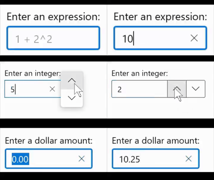
If you write business apps, there are a lot of controls for data input: TextBox, CheckBox, ComboBox, DatePicker, ToggleSwitch, TimePicker, RadioButton, Slider, etc. I always wondered why there was no NumberBox. Numeric input is very common so it needs its own control for it. Luckily there is the Windows UI Library (WinUI), an open source project from Microsoft. I proposed the NumberBox last year and the team did a great job implementing it. It is released in version 2.3 and most of the issues are now solved. Time for a blog post showing of its features.
This animated GIF demonstrates a few of the features like AcceptsExpression, PlaceholderText, SpinButtons and NumberFormatter. I 'stole' it from this tweet.

The possibility to create your own Markup Extensions where added to UWP in the Windows Falls Creators Update SDK (16299, 1709). I only used it once. I created an OnDevice Markup Extensions which I added to the Windows Community Toolkit.
Last month Pedro Lamas wrote the blog post Making the case for XAML Markup Extensions. He demonstrates a FontIconExtension which he uses to shorten the XAML of an AppBarButton. I love his solution. His blog post inspired me to write some new Markup Extensions with the same goal, short XAML.
I'm in the process of learning the new Windows 10 SDK Preview Build 18323. It includes a new control named TwoPaneView. The TwoPaneView is a Panel control which contains two Panes. The Panes are shown next to each other if there is enough room, otherwise below each other. If that is not possible only one pane is shown. You can use it in situations in which you normally used a RelativePanel in combination with some ViewStates to reposition one panel beside or below another depending off the size (AdaptiveTriggers). This was always a lot of work which is now very easy with the new control.
I'm in the process of learning the new Windows SDK Preview. This SDK has made it possible to set the Kind property of a StandardUICommand. The StandardUICommand was added in the 1809 SDK (17763) but the StandardUICommandKind property was readonly which made it impossible to use from XAML. You could only set the Kind using a constructor parameter in code. Now you can define the StandardUICommand in XAML inside your AppBarButton, MenuFlyoutItem and MenuBarItem.
I'm in the process of learning the new Windows SDK Preview. Today's subject is the new IsEditable and Text properties of the ComboBox control.
I'm in the process of learning the new Windows SDK Preview. Today's subject is the new Description property which is added to the TextBox, PasswordBox, RichEditBox, AutoSuggestBox and ComboBox input controls.
I'm in the process of learning the new Windows SDK Preview. Today's subject is the new MenuBar control. You can now create menus with submenus in your UWP apps. Before you could use the Menu control from the Windows Community Toolkit.
I'm in the process of learning the new Windows SDK Preview. Yesterday I wrote a blog about the new AppBarElementContainer. Today's subject is the new CornerRadius property of the Control class. Until now most input controls where rectangular. Now they can have rounded corners.
I have been playing with the new Windows Insider Preview SDK build 17733. It contains a new control named AppBarElementContainer. This control allows you to add other controls then the AppBarButton, AppBarSeparator and AppBarToggleButton to a CommandBar or the "depricated" AppBar.
