The possibility to create your own Markup Extensions where added to UWP in the Windows Falls Creators Update SDK (16299, 1709). I only used it once. I created an OnDevice Markup Extensions which I added to the Windows Community Toolkit.
Last month Pedro Lamas wrote the blog post Making the case for XAML Markup Extensions. He demonstrates a FontIconExtension which he uses to shorten the XAML of an AppBarButton. I love his solution. His blog post inspired me to write some new Markup Extensions with the same goal, short XAML.
Demo project
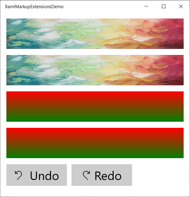
In the following page I have 2 Rectanges, 2 Borders and 2 Buttons inside a vertical StackPanel. The first Rectangle, Border and Button use the traditional (long) XAML syntax. The second ones use the Markup Extension which I created. The XAML is much shorter which makes it for me easier to write and read.
<Page x:Class="XamlMarkupExtensionsDemo.MainPage"
xmlns="http://schemas.microsoft.com/winfx/2006/xaml/presentation"
xmlns:x="http://schemas.microsoft.com/winfx/2006/xaml"
xmlns:local="using:XamlMarkupExtensionsDemo"
xmlns:me="using:XamlMarkupExtensionsDemo.MarkupExtensions"
xmlns:d="http://schemas.microsoft.com/expression/blend/2008"
xmlns:mc="http://schemas.openxmlformats.org/markup-compatibility/2006"
mc:Ignorable="d"
Background="{ThemeResource ApplicationPageBackgroundThemeBrush}">
<Grid>
<StackPanel Spacing="16"
Margin="16">
<Rectangle Height="80">
<Rectangle.Fill>
<ImageBrush ImageSource="https://png.pngtree.com/thumb_back/fw800/back_pic/03/70/72/5257b6c12d89875.jpg" />
</Rectangle.Fill>
</Rectangle>
<Rectangle Height="80"
Fill="{me:ImageBrush Source='https://png.pngtree.com/thumb_back/fw800/back_pic/03/70/72/5257b6c12d89875.jpg' }" />
<Border Height="80">
<Border.Background>
<LinearGradientBrush EndPoint="0.5,1"
StartPoint="0.5,0">
<GradientStop Color="Red" />
<GradientStop Color="Green"
Offset="1" />
</LinearGradientBrush>
</Border.Background>
</Border>
<Border Height="80"
Background="{me:GradientBrush Start=Red, Stop=Green}" />
<StackPanel Orientation="Horizontal"
Spacing="12">
<Button Click="ButtonUndo_Click"
Width="160"
FontSize="32">
<Button.Content>
<TextBlock>
<Run FontFamily="Segoe MDL2 Assets"
FontSize="24"
Text="" />
<Run Text=" Undo" />
</TextBlock>
</Button.Content>
<Button.KeyboardAccelerators>
<KeyboardAccelerator Key="Z"
Modifiers="Control" />
</Button.KeyboardAccelerators>
</Button>
<Button Content="{me:GlyphAndText Glyph='', GlyphFontSize=24, Text='Redo'}"
me:KeyboardAcceleratorExtension.KeyboardAccelerator="{me:KeyboardAccelerator Key=Y, Modifiers=Control}"
Click="ButtonRedo_Click"
Width="160"
FontSize="32" />
</StackPanel>
</StackPanel>
</Grid>
</Page>
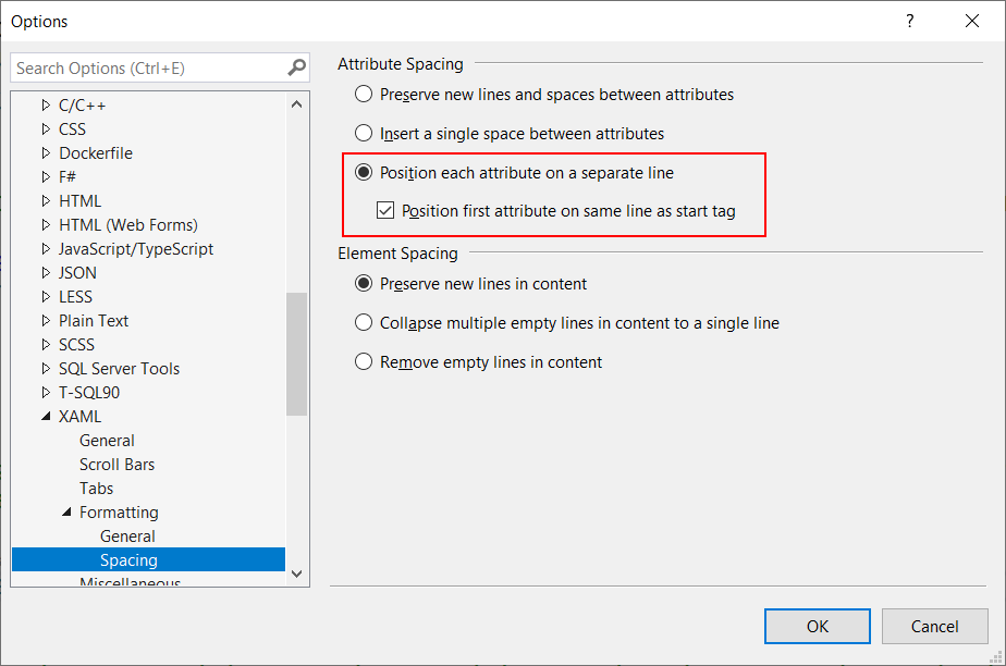
The Rectangle uses an ImageBrush Markup Extension which reduces 3 lines of XAML markup. The Border uses a GradientBrush Markup Extension which reduces 8 lines of XAML markup. The Button uses a GlyphAndText and a KeyboardAccelerator Markup Extensions which reduces 10 lines of XAML markup. I have set up my Visual Studio/Blend Text Editor to 'position each attribute on a separate line'.

This page renders like this:

ImageBrush Markup Extension
The ImageBrushExtension can be used to create an ImageBrush with a Source, Stretch and Opacity.
[MarkupExtensionReturnType(ReturnType = typeof(ImageBrush))]
public class ImageBrushExtension : MarkupExtension {

    public string Source { get; set; }
    public Stretch Stretch { get; set; } = Stretch.Fill;
    public double Opacity { get; set; } = 1.0;

    protected override object ProvideValue() {
        return new ImageBrush() {
            Stretch = this.Stretch,
            Opacity = this.Opacity,
            ImageSource = new BitmapImage {
                UriSource = new Uri(Source),
            }
        };
    }
}
GradientBrush Markup Extension
The GradientBrushExtension can be used to create a GradientBrush with Start and Stop colors and points.
[MarkupExtensionReturnType(ReturnType = typeof(GradientBrush))]
public class GradientBrushExtension : MarkupExtension {

    public Color Start { get; set; }
    public Color Stop { get; set; }
    public Point StartPoint { get; set; } = new Point(0.5, 0);
    public Point EndPoint { get; set; } = new Point(0.5, 1);

    protected override object ProvideValue() {
        var gb = new LinearGradientBrush() {
            StartPoint = this.StartPoint,
            EndPoint = this.EndPoint,
        };
        gb.GradientStops.Add(new GradientStop() {
            Color = Start,
        });
        gb.GradientStops.Add(new GradientStop() {
            Color = Stop,
            Offset = 1,
        });
        return gb;
    }
}
GlyphAndText Markup Extension
The GlyphAndTextExtension can be used to create a TextBlock with a Glyph and a Text.
[MarkupExtensionReturnType(ReturnType = typeof(TextBlock))]
public class GlyphAndTextExtension : MarkupExtension {

    public string Glyph { get; set; }
    public double GlyphFontSize { get; set; } = 14;
    public string Text { get; set; }
    public FontFamily FontFamily { get; set; } = new FontFamily("Segoe MDL2 Assets");

    protected override object ProvideValue() {
        var tb = new TextBlock();
        tb.Inlines.Add(new Run {
            Text = this.Glyph,
            FontSize = this.GlyphFontSize,
            FontFamily = this.FontFamily,
        });
        tb.Inlines.Add(new Run { Text = " " + this.Text });
        return tb;
    }
}
KeyboardAccelerator Markup Extension
The KeyboardAcceleratorExtension can be used to a create KeyboardAccelerator with a Key and Modifiers. It also contains a KeyboardAccelerator attached property which allows you to add it to the KeyboardAccelerators collection of a UIElement.
[MarkupExtensionReturnType(ReturnType = typeof(KeyboardAccelerator))]
public class KeyboardAcceleratorExtension : MarkupExtension {

    /// <summary>
    /// Identifies the KeyboardAccelerator attachted property. This enables animation, styling, binding, etc...
    /// </summary>
    public static readonly DependencyProperty KeyboardAcceleratorProperty =
        DependencyProperty.RegisterAttached("KeyboardAccelerator",
                                            typeof(UIElement),
                                            typeof(KeyboardAcceleratorExtension),
                                            new PropertyMetadata(default(object), OnKeyboardAcceleratorChanged));

    /// <summary>
    /// Gets or sets the virtual key (used in conjunction with one or more modifier keys)
    /// for a keyboard shortcut (accelerator).
    /// </summary>
    public VirtualKey Key { get; set; }

    /// <summary>
    /// Gets or sets the virtual key used to modify another keypress for a keyboard shortcut
    /// (accelerator).
    /// </summary>
    public VirtualKeyModifiers Modifiers { get; set; }

    /// <summary>
    /// Gets the value of the KeyboardAccelerator attached property from the specified FrameworkElement.
    /// </summary>
    public static object GetKeyboardAccelerator(DependencyObject obj) {
        return (object)obj.GetValue(KeyboardAcceleratorProperty);
    }

    /// <summary>
    /// KeyboardAccelerator changed handler.
    /// </summary>
    /// <param name="d">FrameworkElement that changed its KeyboardAccelerator attached property.</param>
    /// <param name="e">DependencyPropertyChangedEventArgs with the new and old value.</param>
    private static void OnKeyboardAcceleratorChanged(DependencyObject d, DependencyPropertyChangedEventArgs e) {
        if (d is FrameworkElement source) {
            var value = (KeyboardAccelerator)e.NewValue;
            source.KeyboardAccelerators.Add(value);
        }
    }

    /// <summary>
    /// Returns a KeyboardAccelerator with the Key and Modifiers set
    /// </summary>
    /// <returns></returns>
    protected override object ProvideValue() {
        return new KeyboardAccelerator() {
            Key = this.Key,
            Modifiers = this.Modifiers,
        };
    }

    /// <summary>
    /// Sets the value of the KeyboardAccelerator attached property to the specified FrameworkElement.
    /// </summary>
    /// <param name="obj">The object on which to set the KeyboardAccelerator attached property.</param>
    /// <param name="value">The property value to set.</param>
    public static void SetKeyboardAccelerator(DependencyObject obj, object value) {
        obj.SetValue(KeyboardAcceleratorProperty, value);
    }
}
The code
I have published the code on GitHub. I hope you like it. Maybe it will inspire you too to create Markup Extensions.
Fons
All postings/content on this blog are provided "AS IS" with no warranties, and confer no rights. All entries in this blog are my opinion and don't necessarily reflect the opinion of my employer or sponsors. The content on this site is licensed under a Creative Commons Attribution By license.


Blog comments
0 responses