You can customize the appearance of your apps in many ways by using the XAML framework like WPF, UWP, WinUI and MAUI. Styles let you set control properties and reuse those settings for a consistent appearance across multiple controls. Styling is to XAML what CSS is to HTML. Using styles, you can group a set of properties and assign them to specific controls or all controls of a specific type, and just like in CSS, a style can inherit (BasedOn) from another style.
Starting with WinUI 2.6 there are new styles for most of the controls. It is encourage you to use the new styles, as they better match the design direction of Windows. You can read more about styling.
BasedOn for System controls
In WinUI the Styles for system controls (Button, CheckBox, TextBox, etc) should set BasedOn="{StaticResource Default<ControlName>Style}", where <ControlName> is the name of the control.
Take the next WinUI3 example in which I have defined two button styles. MyButtonStyle1 is not using BasedOn, MyButtonStyle2 uses the DefaultButtonStyle.
<Window x:Class="ButtonStylingDemo.MainWindow"
        xmlns="http://schemas.microsoft.com/winfx/2006/xaml/presentation"
        xmlns:x="http://schemas.microsoft.com/winfx/2006/xaml"
        xmlns:d="http://schemas.microsoft.com/expression/blend/2008"
        xmlns:mc="http://schemas.openxmlformats.org/markup-compatibility/2006"
        mc:Ignorable="d">
    <Grid Background="{ThemeResource ApplicationPageBackgroundThemeBrush}">
        <StackPanel HorizontalAlignment="Center"
                    VerticalAlignment="Center"
                    Orientation="Vertical"
                    Spacing="12">
            <StackPanel.Resources>
                <Style x:Key="MyButtonStyle1"
                       TargetType="Button">
                    <Setter Property="BorderBrush" Value="Black" />
                    <Setter Property="FontSize" Value="16" />
                </Style>
                <Style x:Key="MyButtonStyle2"
                       BasedOn="{StaticResource DefaultButtonStyle}"
                       TargetType="Button">
                    <Setter Property="BorderBrush" Value="Red" />
                    <Setter Property="FontSize" Value="16" />
                </Style>
            </StackPanel.Resources>
            <Button>Button1 without any Style</Button>
            <Button Style="{StaticResource AccentButtonStyle}">Button2 with AccentButtonStyle</Button>
            <Button Style="{StaticResource MyButtonStyle1}">Button3 with MyStyle1</Button>
            <Button Style="{StaticResource MyButtonStyle2}">Button4 with MyStyle2</Button>
        </StackPanel>
    </Grid>
</Window>
The Window with the buttons will display like this.
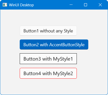
Button1 and Button2 have the rounded corners which where introduced in the Windows 11 design. Button3 has square corners due to the fact that it's style is not based on the DefaultButtonStyle, it doesn't match with the new Windows design. The Style of Button4 is based on the DefaultButtonStyle which makes the button have the correct cornerradius.
In WPF and UWP (not using WinUI2) there are no default styles for the system controls. Make sure you always inherit (using BasedOn) your Styles from the default styles in WinUI 2 and WinUI 3 apps. Not only for a Buttons but for all system controls like CheckBox, TextBox, etc.
All postings/content on this blog are provided "AS IS" with no warranties, and confer no rights. All entries in this blog are my opinion and don't necessarily reflect the opinion of my employer or sponsors. The content on this site is licensed under a Creative Commons Attribution By license.

Blog comments
0 responses