Last week there was a discussion on X (former Twitter) about the usage of the NumberBox in WinUI apps. Should it accept letter inputs or not. The 'conlusion' was that it should because you can enter formulas. But there are also a few developers which don't like this. So I took up the challenge to find a solution for this problem. My first guess was that I should create an AttachedProperty or Behavior for this. I was wrong. AttachedProperties can't be used for this. You can't use them for handing events on controls. Behaviors can but they require you to add an extra NuGet package to the project. Something you might not want. So I decided to use compiled binding (x:Bind) to events, also known as Event Binding.
You can customize the appearance of your apps in many ways by using the XAML framework like WPF, UWP, WinUI and MAUI. Styles let you set control properties and reuse those settings for a consistent appearance across multiple controls. Styling is to XAML what CSS is to HTML. Using styles, you can group a set of properties and assign them to specific controls or all controls of a specific type, and just like in CSS, a style can inherit (BasedOn) from another style.
Starting with WinUI 2.6 there are new styles for most of the controls. It is encourage you to use the new styles, as they better match the design direction of Windows. You can read more about styling.
Accelerator keys (or keyboard accelerators) are keyboard shortcuts that improve the usability and accessibility of your Windows applications by providing an intuitive way for users to invoke common actions or commands without navigating the app UI. You can add them to a Button using the KeyboardAccelerators property. See the example below.
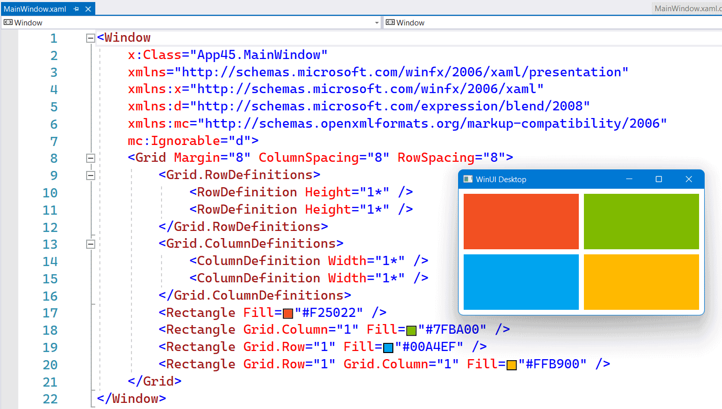
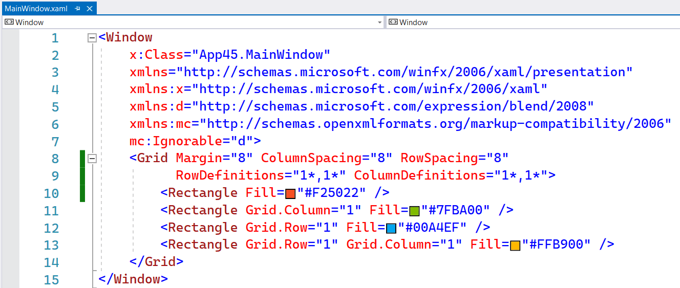
In the XAML of WinUI3 apps you can use the inline syntax for creating Rows and Columns inside a Grid. This is a feature which Avalonia had for a long time. It is more compact and works fine as long as you don't need a Max or Min Width/Height.
The following screenshot shows you a Grid with 2 Rows and Columns. Both in equal size. Using 4 Rectangle elements I created the Microsoft logo inside this Grid.

The following screenshot shows you the same Grid but now with inline RowDefinitions and ColumnDefinitions. It saves you a few lines of XAML.

If you write business apps, there are a lot of controls for data input: TextBox, CheckBox, ComboBox, DatePicker, ToggleSwitch, TimePicker, RadioButton, Slider, etc. I always wondered why there was no NumberBox. Numeric input is very common so it needs its own control for it. Luckily there is the Windows UI Library (WinUI), an open source project from Microsoft. I proposed the NumberBox last year and the team did a great job implementing it. It is released in version 2.3 and most of the issues are now solved. Time for a blog post showing of its features.
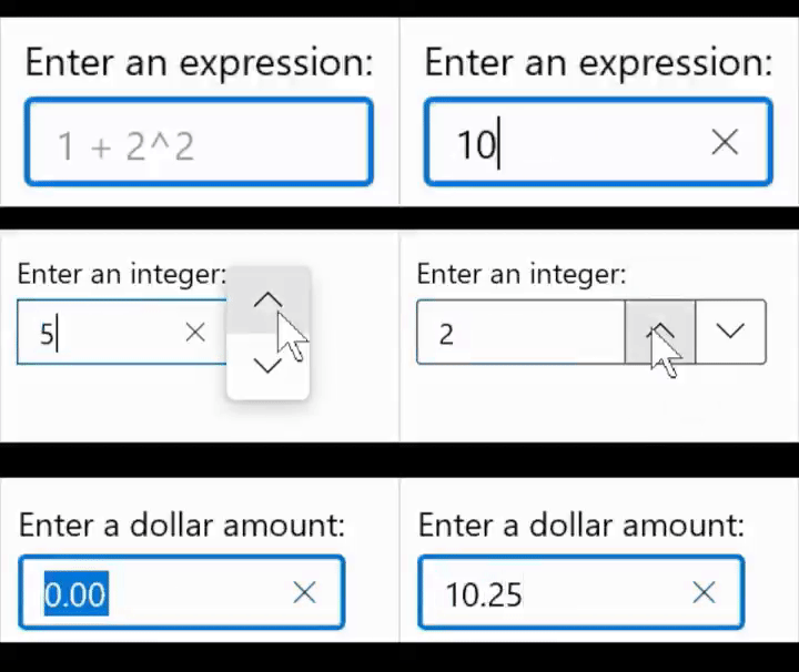
This animated GIF demonstrates a few of the features like AcceptsExpression, PlaceholderText, SpinButtons and NumberFormatter. I 'stole' it from this tweet.

On Monday, the Windows Developer team announced the preview release of the Windows UI Library (WinUI). The WinUI NuGet packages contain new and popular UWP XAML controls and features which are backward-compatible on a range of Windows 10 versions, from the latest insider flights down to the Anniversary Update (1607). Windows developers will no longer need to wait for their users to adopt the latest Windows 10 release in order to provide some of the rich features provided by these packages.
Read the get started article or use this quick step-by-step guide.
Microsoft also published a Sample app on GitHub named XamlUiBasics. The dev branch already contains demos of the new SplitButton, ToggleSplitButton. DropDownButton and the Repeater control. There is not much WinUI documentation available yet so we have to figure out how it works using the sample code.
