Last week I blogged about the new Spacing property in StackPanel that is introduced in the new Windows 10 SDK Preview Build 16225 (Fall Creators Update/CU2). Today I want to explain the new ColumnSpacing and RowSpacing of the Grid control. The RowSpacing can be used to set the amount of space between each row. The ColumnSpacing can be used to set the amount of space between each column. It allows you to create gutters between the rows and columns.
Demo
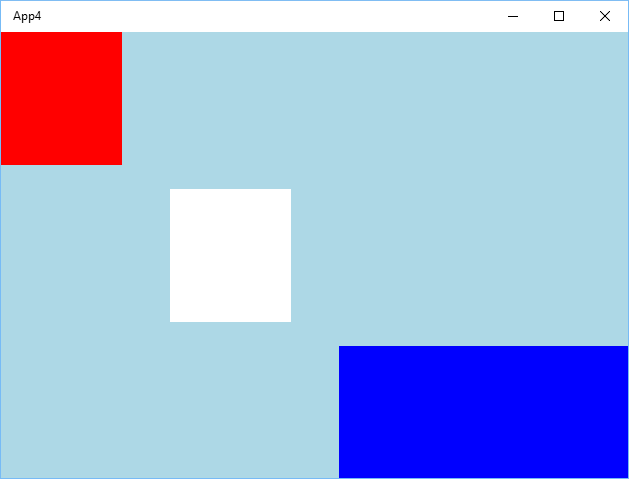
In the next demo page I have a Grid with 4 columns and 3 rows. I have placed 3 Rectangles in it. The first (Red) in the top left cell, the second (white) in row 1 + column 1, the third (blue) in row 2 + column 2 with a columnspan of 2. The ColumnSpacing is set to 48 and the RowSpacing to 24.
<Page
    x:Class="App4.MainPage"
    xmlns="http://schemas.microsoft.com/winfx/2006/xaml/presentation"
    xmlns:x="http://schemas.microsoft.com/winfx/2006/xaml"
    xmlns:local="using:App4"
    xmlns:d="http://schemas.microsoft.com/expression/blend/2008"
    xmlns:mc="http://schemas.openxmlformats.org/markup-compatibility/2006"
    mc:Ignorable="d">
    <Grid Background="LightBlue" RowSpacing="24" ColumnSpacing="48">
        <Grid.RowDefinitions>
            <RowDefinition Height="1*"/>
            <RowDefinition Height="1*"/>
            <RowDefinition Height="1*"/>
        </Grid.RowDefinitions>
        <Grid.ColumnDefinitions>
            <ColumnDefinition Width="1*"/>
            <ColumnDefinition Width="1*"/>
            <ColumnDefinition Width="1*"/>
            <ColumnDefinition Width="1*"/>
        </Grid.ColumnDefinitions>
        <Rectangle Fill="Red"  />
        <Rectangle Fill="White"
                   Grid.Row="1" Grid.Column="1"  />
        <Rectangle Fill="Blue"
                   Grid.Row="2" Grid.Column="2" Grid.ColumnSpan="2"  />
    </Grid>
</Page>
This renders to the following result. There is a gutter of 24 pixels between row 0 and 1 and between row 1 and 2. There is a gutter of 48 pixels between column 0 and 1, between column 1 and 2 and between column 2 and 3. This last gutter is not really visible because the blue rectangle has a columnspan of 2 which means that it also draws itself over the gutter.

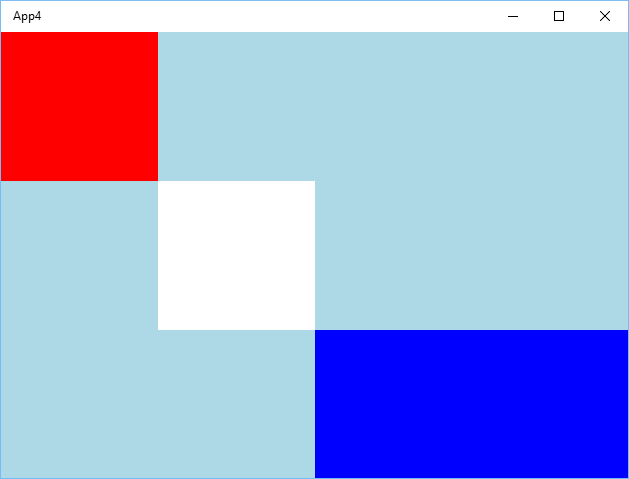
If you remove these properties it will render like this. The white rectangle is connected in the corner with the 2 other rectangles.

XAML Designer Issues
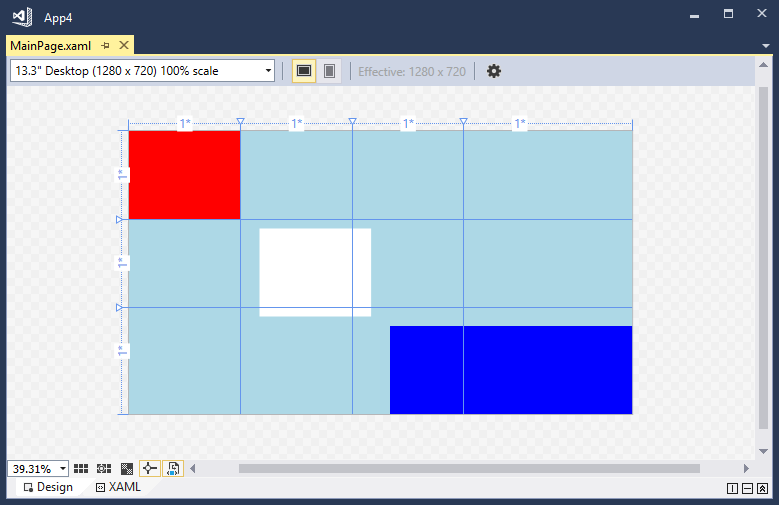
The XAML Designer in Visual Studio 2017 Preview and Blend don't render the Grid correctly yet. But I'm sure that Microsoft will fix that too.

I find the new RowSpacing and ColumnSpacing properties very useful. It removes the need to set the Margin on child elements. I hope you like it too.
Fons
All postings/content on this blog are provided "AS IS" with no warranties, and confer no rights. All entries in this blog are my opinion and don't necessarily reflect the opinion of my employer or sponsors. The content on this site is licensed under a Creative Commons Attribution By license.


Blog comments
Erick
08-Nov-2018 3:01Microsoft sucks
27-Apr-2020 4:00