On Monday, the Windows Developer team announced the preview release of the Windows UI Library (WinUI). The WinUI NuGet packages contain new and popular UWP XAML controls and features which are backward-compatible on a range of Windows 10 versions, from the latest insider flights down to the Anniversary Update (1607). Windows developers will no longer need to wait for their users to adopt the latest Windows 10 release in order to provide some of the rich features provided by these packages.
Read the get started article or use this quick step-by-step guide.
Microsoft also published a Sample app on GitHub named XamlUiBasics. The dev branch already contains demos of the new SplitButton, ToggleSplitButton. DropDownButton and the Repeater control. There is not much WinUI documentation available yet so we have to figure out how it works using the sample code.
Repeater Control
The Repeater control is similar to the ItemsControl we already have. You set or databind the ItemsSource to a collection. You also have to specify the Layout and ViewGenerator properties.
The Layout property can be a StackLayout, FlowLayout, GridLayout or your custom layout. Layouts replace the ItemsPanel property of the ItemsControl. Layouts support virtualization which is very important if you have large datasets and the repeater is in a ScrollViewer. Only the visible items are painted which improves the performance a lot.
The ViewGenerator is a RecyclingViewGenerator which has a RecyclePool property and one or more (Data)Templates. The DataTemplate is used to visualize each item in the Repeater. Similar to the ItemTemplate property of the ItemsControl. The RecyclingViewGenerator also has a SelectTemplateKey event which you can use if you have multiple DataTemplates. The eventhandler should return the name (x:Name) of the DataTemplate to be used to visualize the item. This replaces the ItemTemplateSelector of the ItemsControl which if used would break the virtualization.
Demo Project
I have created a small sample project and published it on GitHub. My demo is heavily inspired by the RepeaterPage.xaml and RepeaterPage.xaml.cs from the XamlUIBasics sample. It uses the latest 17134 (1803) SDK so there is no need to upgrade to an Insiders Preview SDK.
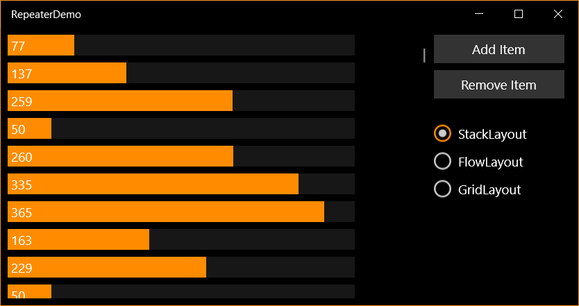
The MainPage contains a Repeater inside a ScrollViewer
<ScrollViewer>
    <controls:Repeater x:Name="repeater"
                       ItemsSource="{x:Bind SampleDataItems}"
                       Layout="{StaticResource VerticalStackLayout}"
                       ViewGenerator="{StaticResource HorizontalElementGenerator}" />
</ScrollViewer>
This creates the following output in which each item is show in a vertical stack.

The RecyclePool, StackLayout and RecyclingViewGenerator are resources inside the Page.
<controls:RecyclePool x:Key="RecyclePool1" />

<controls:StackLayout x:Name="VerticalStackLayout"
                      Orientation="Vertical"
                      ItemSpacing="8" />

<controls:RecyclingViewGenerator x:Key="HorizontalElementGenerator"
                                 RecyclePool="{StaticResource RecyclePool1}">
    <DataTemplate x:Key="hItem"
                  x:DataType="l:SampleData">
        <Grid Background="{ThemeResource SystemChromeLowColor}"
              HorizontalAlignment="Left"
              Width="{x:Bind Max}">
            <Rectangle Fill="{ThemeResource SystemAccentColor}"
                       Width="{x:Bind Value}"
                       Height="24"
                       HorizontalAlignment="Left" />
            <TextBlock Text="{x:Bind Value}"
                       VerticalAlignment="Center"
                       HorizontalAlignment="Left"
                       Margin="4,0" />
        </Grid>
    </DataTemplate>
</controls:RecyclingViewGenerator>
The radio buttons can be used to switch to a different Layout and ViewGenerator.
FlowLayout
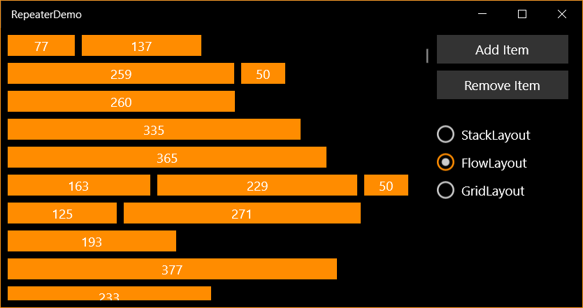
In the FlowLayout all items are shown next to each other and wrap to the next line if necessary.

The RecyclePool, FlowLayout and RecyclingViewGenerator are resources inside the Page.
<controls:RecyclePool x:Key="RecyclePool2" />

<DataTemplate x:Key="FlowBarTemplate"
              x:DataType="l:SampleData">
    <Border Background="{ThemeResource SystemAccentColor}"
            Width="{x:Bind Value}"
            Height="24"
            VerticalAlignment="Top">
        <TextBlock Text="{x:Bind Value}"
                    VerticalAlignment="Center"
                    HorizontalAlignment="Center" />
    </Border>
</DataTemplate>

<controls:FlowLayout x:Name="FlowLayout"
                     Orientation="Horizontal"
                     MinItemSpacing="8"
                     LineSpacing="8" />

<controls:RecyclingViewGenerator x:Key="FlowElementGenerator"
                                 RecyclePool="{StaticResource RecyclePool2}">
    <StaticResource x:Key="fItem"
                    ResourceKey="FlowBarTemplate" />
</controls:RecyclingViewGenerator>
GridLayout
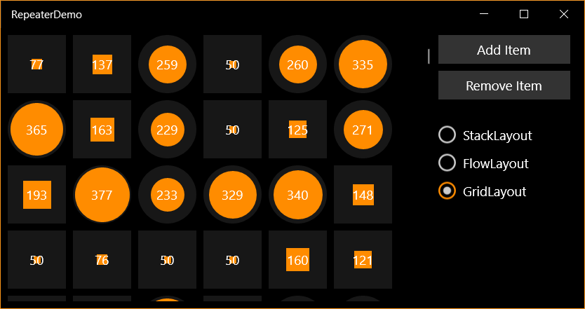
In the GridLayout all items are shown in a GridView. Rectanges are shown for values below 200 others are Ellipses.

The RecyclePool, GridLayout and RecyclingViewGenerator are resources inside the Page.
<controls:RecyclePool x:Key="RecyclePool3" />

<controls:GridLayout x:Name="GridLayout"
                    MinItemSpacing="8"
                    LineSpacing="8" />

<controls:RecyclingViewGenerator x:Key="GridViewGenerator"
                                 RecyclePool="{StaticResource RecyclePool3}"
                                 SelectTemplateKey="GridViewGenerator_SelectTemplateKey">
    <DataTemplate x:Name="EllipseItem"
                    x:DataType="l:SampleData">
        <Grid>
            <Ellipse Fill="{ThemeResource SystemChromeLowColor}"
                     Height="{x:Bind MaxSize}"
                     Width="{x:Bind MaxSize}"
                     VerticalAlignment="Center"
                     HorizontalAlignment="Center" />
            <Ellipse Fill="{ThemeResource SystemAccentColor}"
                     Height="{x:Bind Size}"
                     Width="{x:Bind Size}"
                     VerticalAlignment="Center"
                     HorizontalAlignment="Center" />
            <TextBlock Text="{x:Bind Value}"
                       VerticalAlignment="Center"
                       HorizontalAlignment="Center" />
        </Grid>
    </DataTemplate>
    <DataTemplate x:Name="RectangleItem"
                  x:DataType="l:SampleData">
        <Grid>
            <Rectangle Fill="{ThemeResource SystemChromeLowColor}"
                       Height="{x:Bind MaxSize}"
                       Width="{x:Bind MaxSize}"
                       VerticalAlignment="Center"
                       HorizontalAlignment="Center" />
            <Rectangle Fill="{ThemeResource SystemAccentColor}"
                       Height="{x:Bind Size}"
                       Width="{x:Bind Size}"
                       VerticalAlignment="Center"
                       HorizontalAlignment="Center" />
            <TextBlock Text="{x:Bind Value}"
                       VerticalAlignment="Center"
                       HorizontalAlignment="Center" />
        </Grid>
    </DataTemplate>
</controls:RecyclingViewGenerator>
The SelectTemplateKey eventhandler is used select the EllipseItem DataTemplate or the RectangeItem DataTemplates which are defined inside the GridViewGenerator RecyclingViewGenerator. These DataTemplates have a x:Name and not a x:Key like the one in the HorizontalElementGenerator and FlowElementGenerator.
private void GridViewGenerator_SelectTemplateKey(RecyclingViewGenerator sender, Microsoft.UI.Xaml.Controls.SelectTemplateEventArgs args) {
    args.TemplateKey = ((SampleData)args.DataContext).Value >= 200 ? nameof(this.EllipseItem) : nameof(this.RectangleItem);
}
Closure
The new Repeater control looks very useful. There are still a few things which I'm missing or unknown.
- How do you set ItemContainerTransitions? I excpect I will have to use Composition Animations.
- How do you use the RecyclePool correctly? I created three pools, one for each RecyclingViewGenerator.
- How do you implement a ScrollIntoView logic. It looks like you need to place the Repeater inside an ElementTracker for that. ElementTracker enables Repeater to coordinate with ScrollViewer down-level.
We will have to wait for more docs.
Fons
All postings/content on this blog are provided "AS IS" with no warranties, and confer no rights. All entries in this blog are my opinion and don't necessarily reflect the opinion of my employer or sponsors. The content on this site is licensed under a Creative Commons Attribution By license.


Blog comments
Tony Henrique
03-Aug-2018 7:39