Recently I used Conditional XAML for the first time in one of my UWP apps. I wanted to use a ColorPicker control which is only available in the Fall Creators Update (version 1709, build 16299). The Microsoft documentation explains what Conditional XAML is really well.
Conditional XAML provides a way to use the ApiInformation.IsApiContractPresent method in XAML markup. This lets you set properties and instantiate objects in markup based on the presence of an API without needing to use code behind. It selectively parses elements or attributes to determine whether they will be available at runtime. Conditional statements are evaluated at runtime, and elements qualified with a conditional XAML tag are parsed if they evaluate to true; otherwise, they are ignored.
Conditional XAML is available starting with the Creators Update (version 1703, build 15063). To use conditional XAML, the Minimum Version of your Visual Studio project must be set to build 15063 (Creators Update) or later, and the Target Version be set to a later version than the Minimum. See Version adaptive apps for more info about configuring your Visual Studio project.
While testing my app I noticed that it can be a little tricky when you combine it with {x:Bind}. Let me explain this using a simple demo.
Op het TechDays 2017 event van Microsoft heb ik een sessie gepresenteerd met de titel 'New XAML UWP Features in Windows 10 Fall Creators Update'. Via deze blog wil ik de video, presentatie en source code met u delen.
Windows (UWP) apps use animations to enhance the user interface or to make it more attractive without annoying your users. One way you can do this is to apply animated transitions to UI so that when something enters or leaves the screen or otherwise changes, the animation draws the attention of the user to the change. As you can read in the documentation (Animation overview) you can use the reposition animations (RepositionThemeTransition) to move an element into a new position. For example changing the position (Row/Column) of an item in a Grid.
Last week I blogged about the new Spacing property in StackPanel that is introduced in the new Windows 10 SDK Preview Build 16225 (Fall Creators Update/CU2). Today I want to explain the new ColumnSpacing and RowSpacing of the Grid control. The RowSpacing can be used to set the amount of space between each row. The ColumnSpacing can be used to set the amount of space between each column. It allows you to create gutters between the rows and columns.
A few days ago Microsoft released the new Windows 10 SDK Preview Build 16225 (Fall Creators Update/CU2). While browsing the 'API Updates and Additions' I noticed there is a new Spacing property for the StackPanel control. You can use it to set the amount of space between each child element. The StackLayout control of Xamarin Forms already had this property. This will make it easier to add this property to the XAML Standard.
Last week I wrote a blog item about the XAML Animated Headered TextBox Style. I got a lot of reactions on Twitter. Pieter Otten challenged me into adjusting my solution to make it conform the Material Design guidelines. In Android the header (Label) of the TextBox (Text Field) animates on Focus not when you enter a value. I tried to implement this by adjusting my style but that didn't work. I had to introduce an extra behavior to get it to work. See the result in this video.

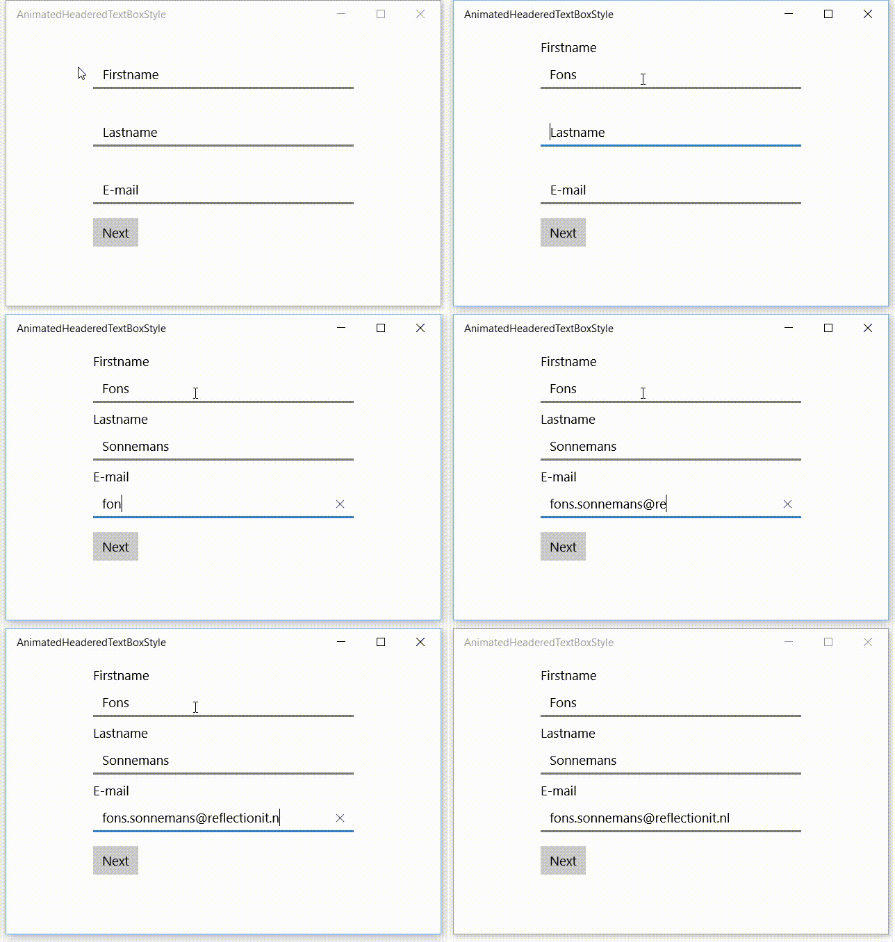
A while ago I saw a beautiful effect in an Android app which I was using. It had textboxes with a placeholder text. This placeholder text moved to the header when you enter the first character in the textbox. This triggered me to do the same in a Windows 10 XAML app (UWP). This is a video of the result.

XAML is very powerful. I have blogged about behaviors a lot. They are great but also have limitations. You can only drag them on Controls, not on Storyboards. To "fix" this I came up with a solution using Attached Properties. The designer support isn't as good with Behaviors but who needs that if we have IntelliSense.
I love C#, XAML and Blend. It is very powerful and lets me create powerful solutions. As a example of it's power I will demonstrate my ScrollSelectedItemIntoViewBehavior. It will let you scroll to a selected item into view of a ListView or GridView without having to write any code.
I have been using Adobe software recently and I noticed you could do simple calculations in textboxes. I used it to export Tile Images in different scale sizes. If the 100% scale of an Image is 150 pixels wide you can enter '150 * 1.5'. It will calculate the width of 225 pixels for the 150% scale size. I loved this feature so I tried to implement it also for my own Xaml apps.
The solution is quite simple. I have created a Behavior called CalculatorBehavior. You just use Blend for Visual Studio to drop it on a TextBox control and you are done.

